3 Feb 2016

27 Jan 2016
22 Jan 2016
Question 3: What kind of media institution might distribute your media product and why?
Below is the script in case there is a problem with the audio:
My media product is aimed at predominantly females,
aged 13-19, who are new affluent workers, and therefore I would prefer a
magazine publisher that has experience with these particular social groups.
The publishing company that distributes ‘Q’ magazine
is Bauer Media Group. Bauer media is Europe’s largest privately owned
publishing group. The group is a
worldwide media empire offering over 300 magazines in 15 countries, as well as
online, TV and radio stations. Bauer media also distribute well established
magazines such as ‘Kerrang’ and ‘Mojo’, leaving a gap in the market for my
genre of magazine, as these brands have an older, more mature demographic than
I do. Additionally, as it is the largest publishing company in Europe, they
will have a lot of connections within the industry, meaning that it would
attract constant, regular customers and also it can be trusted to ensure that
good quality media products are provided as it has a high status within the
industry. Additionally, they would be able to publish the magazine in different
languages as they are spread across the whole of Europe. Bauer Media Group have
pre-established systems for large scale distribution which would benefit my
publication by providing multiple points of exchange.
Contrastingly, ‘Mixmag’ has
an independent publishing company, aimed at a more niche audience, which was
set up by two former EMAP executives David Hepworth and Jerry Perkins. This
type of publishing company wouldn’t be as appropriate for my magazine as I have
quite a large target market, that I would like to have easy access to my
product. Although Mixmag do sell over 20,000 copies a year, I believe Bauer
Media would be a better distributer for my product as it has better brand
recognition and there is a gap in its market for my product as it
doesn’t publish any other pop magazines.
‘Classic Pop’ is published
by Anthem Publishing which is also an independent publishing company that was
awarded the PPA Independent Publishing Company of the Year. However, this
company is not the best option for my magazine as Classic Pop is the same genre
as my magazine, meaning that there would be competition for my magazine within
the company, making it more difficult to promote my magazine.
Considering the expansion
of technology recently, I would make my magazine available on apps such as
Snapchat, as it is frequently used by the people in my demographic and
therefore would be good for promoting my magazine. Additionally, there are apps
that available on smartphones that the magazine can be accessed through, which
would also be an appropriate approach to appeal to my demographic.
In summary, I would like
Bauer Media to distribute my magazine as it is the largest publishing company
in Europe, meaning it will have the means to distribute my product. I will also
use social media and smartphone apps to attract my demographic as they are
commonly used by teenagers who are within my demographic.
12 Jan 2016
Question 4: Who would be the audience for your media product?

My typical audience member would be around the age of 16, from a lower middle class with a fairly young income as they may only have a part time job or weekend job. They would most likely be in education, whether its college, sixth form or school. The regional identity of my audience member would be a suburban, town and they would probably be of a white ethnicity, as that is the dominating ethnicity in the UK.
4 Jan 2016
29 Dec 2015
17 Dec 2015


16 Dec 2015
15 Dec 2015
Responding to my Focus Group Feedback

The majority of my focus group agreed that the purple was too overpowering and made the article seem quite childish. Therefore, I decided to introduce blue into my colour scheme in order to balance it out a bit.

I changed the colour of the questions to blue and also made the standfirst blue as the white seemed slightly harsh against the black background.
Addressing a Focus Group in my Demographic

I felt that there was too much purple on the double page spread, and it seemed quite overpowering so I conducted a short, structured survey with a demographic focus group to see whether they agreed or disagreed.
Double Page Spread Stages

The first thing I did after positioning the photograph was create the running head, this ensured that my magazine had continuity and that it was clear to the reader which magazine the article belongs to. I also created a stand-first on the right hand side of the page as there would have been no other text on there otherwise. I made it slightly off white so it matches the background and also so it contrasts with the image it is placed on. I also created a heading using the same fonts as I used on the front cover to establish a house style within the magazine. I used the same fonts to create a drop cap and a pull-out quote for the same reasons.

I then created all the text to go in my article by creating an interview style conversation. I used very chatty, colloquial language to ensure I created the friendly mode of address that my demographic desired when I carried out my survey. I used two different colours to make it very clear the difference between the two speakers. I used purple and black font in able to continue the girly, fun house style I created on my front cover and contents page.
14 Dec 2015
Editing My Double Page Spread Photograph
 I cut the image out using the magnetic lasso tool allowing me to crop around the edges cleanly and sharply. I then finished the edges the edges using the eraser tool and the blur tool to create a more seamless finish. I placed it on the right hand side of the page as although it is different to my layout sketches, it allows me to interlock the text with the picture, increasing the overall aesthetic appeal.
 I then added the brightness tool to brighten up the image and make it stand out more on the page.


Contents Page Improvements

- I made the right and left hand columns take up the same amount of room by aligning them with lines using the grid tool. This is because the left hand side was taking up a lot more room than the right hand side.
- I also made the picture of the boyband slightly bigger, as pictures are more visually stimulating to the reader and I believe it is important to keep a balance of the two, even though I decided to use predominantly text.
- I edited the page number slightly by making it grey and adding an outer glow to it, as when it was pink it blended in with the background a bit and couldn't really be seen.
Progression Of Contents Page

I added another section to my contents called 'ON THE COVER' which lists most of the features mentioned on the cover, this allows the reader to navigate throughout the magazine and makes it clear where all the articles are in the magazine. I followed the exact same process as I did when creating the 'FEATURES' column to make sure they were identical to create a professional brand identity and to make it very easy to navigate throughout.
Although adding this much text goes against my survey, I believe it was necessary as it didn't provide very much information to the reader about the contents of the magazine.
10 Dec 2015
Addition of Pictures to my Contents Page

I added the pictures that I cropped to my contents page in the appropriate position and I also added a picture that I took at a concert at the bottom to add a variety of images, making it appeal to more people.

Editing Contents Page Pictures


I edited this photograph of my cover star for my contents page by using the magic eraser tool and the eraser tool to remove the background


I edited this picture in the same way so I could layer this picture over a background. I used the magnetic lasso tool on some of this picture as the edges contrasted well with the background.
Creating My First Contents Page Draft

1. The first thing I did was create a title saying 'CONTENTS' to make it clear to the reader what the page is. I also added a running head to make it clear what magazine it is, and also to establish a house style throughout the magazine. This was also achieved by the continuation of the purple and pink colour scheme that follows on from the front cover.

I used the text tool to create these headings

I used the rectangle tool to create the boxes that make up the columns of the magazine


I used the rectangle tool to create the boxes that make up the columns of the magazine

2. I also added some boxes to create a structure and rough layer on the contents page. I coloured them to match the colour scheme of the magazine which creates a professional brand identity. I changed the layout from my draft sketches as I felt this layout combined all three and allowed me to provide a lot more information, as the pictures don't take up as much space.

3. I added some features using a variety of page numbers to replicate the length of an average magazine. I used a variety of fonts that were also used on the front cover to make it follow the same house style.
9 Dec 2015
Contents Pictures
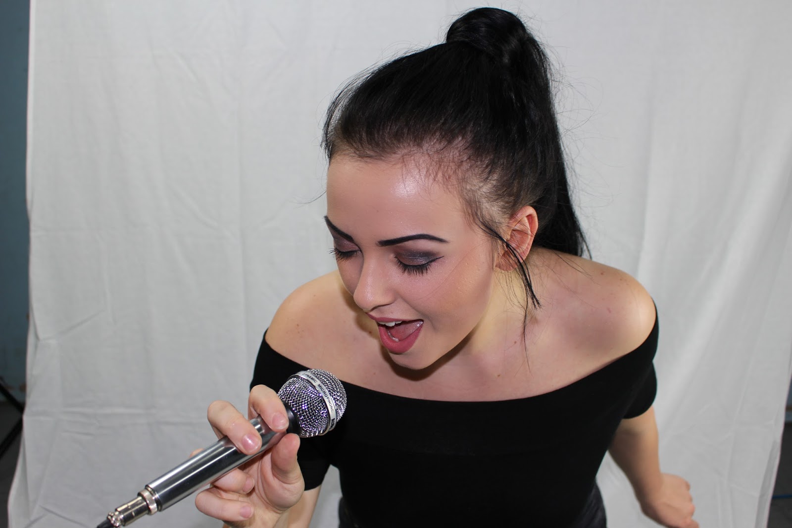
Following the same process as I did to take my feature article photo, I took photos of my cover star for my contents page:


Subscribe to:
Posts (Atom)