The first thing I did after positioning the photograph was create the
running head, this ensured that my magazine had continuity and that it was clear to the reader which magazine the article belongs to. I also created a
stand-first on the right hand side of the page as there would have been no other text on there otherwise. I made it slightly off white so it matches the background and also so it contrasts with the image it is placed on. I also created a
heading using the same fonts as I used on the front cover to establish a house style within the magazine. I used the same fonts to create a
drop cap and a
pull-out quote for the same reasons.

I then created all the text to go in my article by creating an
interview style conversation. I used very
chatty, colloquial language to ensure I created the friendly
mode of address that my
demographic desired when I carried out my survey. I used two different colours to make it very clear the difference between the two speakers. I used purple and black font in able to continue the girly, fun
house style I created on my front cover and contents page.


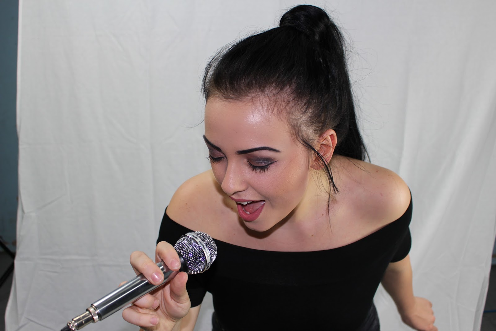
 I cut the image out using the magnetic lasso tool allowing me to crop around the edges cleanly and sharply. I then finished the edges the edges using the eraser tool and the blur tool to create a more seamless finish. I placed it on the right hand side of the page as although it is different to my layout sketches, it allows me to interlock the text with the picture, increasing the overall aesthetic appeal.
 I then added the brightness tool to brighten up the image and make it stand out more on the page.