Q analysis from katiewinn
29 Oct 2015
Mixmag Summary
I think
that they simplistic, stripped back tone of the front cover is successful as it
makes the magazine seem authentic, additionally, it is very minimalistic
meaning that it is not too overpowering, making it user friendly. I would like
to mirror this tone in my magazine as it feels young and fresh, appealing to my
ideal demographic of 15-25 year olds. I think that the contents page is successful
as it uses contrasting colours to make the text and pictures stand out,
however, I don’t like how they didn’t follow a strict house style, as it makes
it unprofessional and confuses the mode of address. I like how the double page
spread mirrors the simplistic, authentic feel of the front cover, which I would
like to replicate in my magazine.
28 Oct 2015
Mixmag Magazine - Double Page Spread Analysis
The headline of the feature is a very prominent feature on the page as it follows convention by taking up approximately one third of the page, making it stand out. It is written in all lower case letters to make it seem more relaxed, which is mimicked by the curvy, flowing font. The black font contrasts with its white background to give it a modern, contemporary tone, as well as ensuring the headline is entirely legible.
The featured photo is a mid shot of the artist 'Helena Hauff' which gives the audience a visual stimulant, allowing them to connect with her. The shot is posed, but still looks very natural, connoting authenticity and allowing the reader to relate to her. Her eyes are looking slightly above the camera to make her seem superior and slightly intimidating, the it reiterated by her serious, unapproachable facial expression. The photograph is approximately the same size as one page, however it is shifted over to leave a lot of negative space and to make it interlock with the headline, this makes it seem simplistic, drawing all the readers attention to the photograph.
The colours used on the double page spread are all black and white or neutral, this creates strong contrasts and ensures all the text can be read. This also suggests that it is very authentic as it creates a very natural, stripped back tone.
The article doesn't include many conventional features, however it does have a running head and a standfirst. The running head is at the top of the magazine, and is used merely to allow readers to see who the article is about when flicking through the pages. The standfirst is used to provide information about the reader, to entice the reader and get them invested in the article. The language in the standfirst is persuasive, which helps to encourage the reader to read the full article.
The main body of text is played out in columns connoting that it is informative and professional, however, it is very laid-back, casual language, aiding the magazine in portraying a relaxed, carefree mode of address.
27 Oct 2015
Classic Pop Summary
Classic Pop Magazine - Double Page Spread Analysis
This feature is longer than two pages, however the first double page follows some of the same conventions as a normal double page spread.
The typography of the headline is capitalised and bold making it legible and user friendly, this also makes it stand out, making it clear to the reader what the article is about. The font used is sans serif making it quite simplistic and easy to read, however it is slightly quirky as it is has lots of harsh angles making it seem edgy and unique, this suggests to the reader that the article is unique, as well as giving it personality. The emotive language used in the headline is intriguing and makes the article seem authentic and honest. The title is white to contrast with the dark background, this connotes that the article is pure and creditable. Conventionally, headings take up approximately one third of the page, meaning that this title breaks convention, however, it is still very clear that it is the title, and it still fulfils its roles of enticing the reader and summarising the article.
The picture that is featured in the article takes up the entire page and is used as a background, this means that there is no negative space, making it feel more exciting and interesting. The picture used it a low angle shot which makes the band 'Years and Years' seem superior, making the reader more inclined to idolise them. It is a mid shot of a group that is obstructed by writing, this suggests that the group are exposed, emphasising the articles authentic tone. The shot is posed-candid which makes it feel natural and relaxed, reflecting the magazines house style and mode of address.
This article uses a standfirst to provide additional information about the band for the reader, making them intrigued and interested. The text is capitalised to make it more prominent and highlight it's importance. This is conventional, therefore making the magazine seem more professional and sophisticated.
The main body of text conventionally begins with a drop cap which captures the readers attention, as it stands out a is a prominent feature on the page. This is effective as it makes them want to read on and find out more. However, the magazine breaks some conventions as it doesn't include a kicker, pull quote, running head or lede.
The language used in the feature is slightly more formal than most magazines, suggesting that it's target market includes people from the established middle class, that are well educated and have a strong interest in the artists personal life, as well as their music, as the article reveals personal information about the artists childhood and sexuality. This also exaggerates the authentic tone as it allows the reader to really connect with the artists. The mode of address is friendly and welcoming in the article as although it is about the band, it seems to be from an insiders perspective as it is detailed and personal.
6 Oct 2015
Practice Photography
During the lesson we experimented with photography to prepare to take our feature article photographs. We tried different backgrounds to see which was most effective and used different soft box lights and angles to create the correct amount of shadows and brightness.

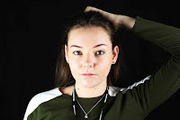
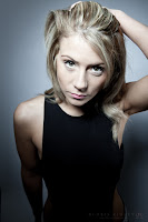
 I took inspiration from the picture on the left to create the picture on the right. However, I decided to use a black background rather than white as I feel it made the picture clearer and it made her face stand out, to improve I would use a green background to prevent her hair from blending in with the background. Additionally, I used a different angle as I believe the high angle shot makes the subject look vulnerable, whereas the eye level shot avoids an intimidating feel, and makes the viewer feel equal to the subject.
I created this photo using a generic pose that shows authority and power, this experiments with the mode of address as it gives a slight sense of superiority. I edited the photo using Photoshop and added a black and white filter to make it seem more serious as it has a lack of bright colours. I used a soft box light to light the background of the picture and one to light the right hand side of her face, this made it well lit. To improve it i could have added more light to the left hand side of the photo in the foreground to make it more equal. I also should have taken the photo from a low angle this would have added to the sense of superiority, rather than an eye contact face shot which gives a sense of equality. I could have made the lighting more equal by experimenting with a reflector to balance out the lighting.
The images below show evidence of me experimenting with the lighting and positioning when producing the photographs that follow
2 Oct 2015
Subscribe to:
Comments (Atom)


