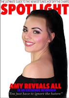
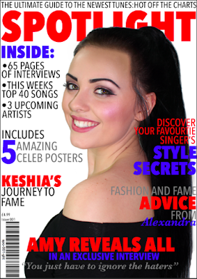
Following my focus group survey, I decided to change my colour scheme to pink and purple, as it is more feminine and therefore appealing to my demographic. Additionally, I feel it fits in better with a pop genre, as the colours connote innocence and youth, as well as being a lot less threatening than red and blue, as they are a lot more harsh.
24 Nov 2015
Demographic Focus Group
Despite my survey results, I felt my front cover seemed too masculine for my predominantly female demographic and therefore I conducted a short structured interview with a focus group of members of my demographic to see what their opinions were.
The majority of the focus group agreed that the magazine seemed rather masculine and didn't link very well with the pop genre. Additionally, they felt it did not create a chatty, friendly tone as it looked quite serious.
Creating My First Draft
Firstly I positioned my masthead at the top of the page as this is conventional, and therefore will be when the audience look to see it. I also chose to make it take up approximately 1/5 of the page as it is a very prominent feature, and often a selling point for what is in the rest of the magazine. I believe this will appeal to my demographic as it is a bright, fun colour and stands out.

The puff the I chose to include was "THE ULTIMATE GUIDE TO THE NEWEST TUNES:HOT OFF THE CHARTS" as I believe it fulfils its role of promoting the magazine and boosting its status, as well as having a fun, current tone and a friendly, exciting mode of address.
I inserted my edited feature article photo onto the page using the 'place embedded' tool as it allowed me to make it it's own layer. I positioned in so her face was central which made it look professional and drew attention to it. This positioning also allowed me to have plenty of space along the sides for plugs.
I then created these cover lines which provide information about the cover star and make it clear to the reader who she is, and what the article about her includes. I chose to make these red and blue and in the same typography as the masthead to establish a house style. Additionally, I made the pull quote a handwriting style typography to add personality to it, making it seem more authentic.
I chose to incorporate blue as it complimented the red well and was more exciting and interesting than using black or white
I then added a variety of plugs which promote the contents of the magazine and allow the audience to see very clearly what is inside the magazine. I used the same fonts as I did in the puff and masthead to establish a professional, neat house style and also made them red, blue and monochrome to fit in with the colour scheme of the rest of the front cover. My demographic wanted a chatty, informal tone and I believe having lots of short plugs will create this, additionally this busy, chatty style would be interested in these plugs as they resemble a gossip magazine and my demographic are interested in celebrity culture and lifestyle as well as the actual music.
Analysis of my Feature Article Photograph
When taking the photo, I decided to have the cover star making eye contact with the camera as it makes her seem relatable and interested, and ensures that she doesn't seem superior. I also decided the have it very well lit to make her completely visible, meaning that she doesn't seem intimidating or daunting. I had one soft box studio light, lighting up a white background to make it very vibrant, as well and two soft box lights lighting her from in-front to make sure there are no harsh shadows on her face. I held the camera just below the highest light so that it didn't distort the image at all. Additionally, I made sure that the flash was on, to provide as much light as possible. I chose to position the cover star so she was looking over her shoulder as it suggested that she was laid back and relaxed, while still being well put together.
Editing my Feature Article Photograph
To cut around the picture I used the magnetic lasso tool as it enabled me to achieve an accurate, precise finish. However, to make it slightly less obvious that the image had been cropped I used the blur tool and set it to a low intensity, to make the edges less harsh and the cropping more subtle. I changed her hairline very slightly, to achieve a more sleek looking hairstyle, as I aiming to present a look that encourages the reader to idolise the cover star, by making her very put together and made up. I also enhanced the make up she had on by intensifying the colours by increasing the saturation slightly, this made her seem very glamorous and makes it clear to the reader that she cares about her appearance/the way she is portrayed. Finally, I used the blemish tool to get rid of any imperfections on her face which allowed me to create a flawless finish on her skin.
Creating My Masthead
Firstly, I came up with the title 'SPOTLIGHT' as I felt it created a fun, current vibe that relates to the genre of music that my magazine is about. I selected a very basic font to make it as user friendly as possible, ensuring the user can read it, however, the harsh angles and bold typography create a contemporary feel, making the magazine feel current and up to date. I selected a red font as in my survey, my demographic opted for a red, black and white colour scheme, and I felt the masthead should be one of the main features that stands out.
I used the text tool in order to create the masthead as it allowed me to change the settings to achieve my desired look. I selected the font 'Avenir Next Condensed Heavy' as it is very easy to read and fits in with the style of my magazine.
12 Nov 2015
Constructing Images To Appeal To My Demographic
I took some potential feature article photographs using 3 soft box studio lights, two to light her face, and one to light the background. I also used a white background to contrast with her hair and outfit.
These photos show me taking the photos:
Taking my Feature Article Photograph
Firstly, I did my cover stars makeup and hair to create a young, current look which would appeal to a young demographic. I wanted to make it seem like she cared about her appearance, so the audience would think she cares about them. I put her hair into a slick ponytail to make her seem put together and presentable, also because this is fashionable and my demographic would be interested in current trends and celebrity style. Despite the makeup being very dramatic, I went for fairly neutral colours to make her seem normal and relatable. I chose a black top which had a very wide neck as it is sophisticated and connotes elegance, making my demographic inclined to idolise her.
After this, I set up a white screen to create the best visibility and roughly positioned the soft box studio lights to light up the background and the foreground.
I then positioned my model appropriately and started to investigate with angles and lighting.
11 Nov 2015
Photoshoot Inspiration
I collected some images online, baring in mind the age group of my demographic and the fact that my cover star should be aged 13-20, to give me inspiration for my feature article photograph.
6 Nov 2015
Double Page Spread Layout Sketches
I have chosen to use the third sketch as it is the busiest design, and is also very unique and quirky. It is the most aesthetically pleasing and uses 2 pictures, meaning that it is more fun and interesting that the others. However, to improve it I may add another picture as in my survey the majority of people said they wanted 2-3 pictures.
Contents Page Layout Sketches
I have chosen to use the second contents page sketch as it contains the most pictures and is the busiest, this is because my target audience wanted the contents page to be predominantly pictures. However, I will add more pictures to make it even busier and aesthetically appealing and also I will make the editors message smaller so it doesn't take up as much space on the page. Additionally, the dominance of pictures will make the magazine more informal, as they will be brightly coloured and aesthetically appealing, therefore allowing me to achieve a friendly, chatty mode of address.
Front Cover Layout Sketches
I have chosen to use the third design as it is the most appropriate design to appeal to my target audience. This particular layout will appeal to my demographic as in my survey results, there was a unanimous decision to have a mid shot of my cover star as the feature article photograph. Additionally, my most of my audience preferred a busy front cover, and this layout doesn't leave very much negative space as the plugs and cover lines make it very visually stimulating. However, I may add some plugs on the right hand side as well to make it more conventional and busier. It also follows conventions by having the feature article photograph covering the mast head, this makes it stand out and grab the readers attention. Additionally, none of the cover lines obstruct the feature article photograph meaning it captures attention and is highly visible.
Subscribe to:
Comments (Atom)


